
Wondering What Fonts To Use For Your Book Cover?
First, consider the length of your heading. If your title is lengthy, think about the surface area on your cover. Will your title take up the area of your book cover? Do you have a cover image/illustration? You may consider just positioning a decorative font in place of an illustration.
What is the topic of your story? Should you use a decorative type, a san serif type or a serif type? Should it be bold or should it be a condensed (narrow) typeface?
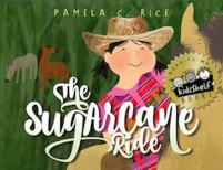
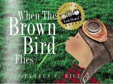
When your title of only two, three, or four words, you can certainly be more creative. Think of your title as a puzzle. (see RUFUS) Pick out the keywords in your title and place emphasis on the keywords by making them larger.

If the type font you select, has alternative CAPS, you may consider using them. Most will contain a decorative ’swash’ that you can place at the beginning and the end of the title.
 Select a font with alternative CAPS or letters ("h", "g" and "n")
The more words you use, consider a condensed font. You don’t want to lose the size of your title by going smaller to fit everything on. NOTE: No, squishing, please! (That’s taking a font and squeezing it horizontally. In the industry it is called ‘bastardizing’ the font) Most designers and publishers will recognize type that has been altered like this. Just go through a font library a find a CONDENSED FONT. Most traditional families of fonts have a condensed version, but not all. Also, think about breaking your title up into the Main title with a smaller subtitle. If you were to use a decorative font, it could get rather busy when your title is too long.
 Place make keywords larger and use a CONDENSED font
Try not to get to ‘cutesy’ with your book font style, especially if it is not fitting to the story. Most of your decorative fonts are available for use with one or two words at the most. Using decorative fonts for a long title is like adding lace doilies and knick-knacks in excess or ‘gilding-the-Lilly’.
If you use a decorative font for the title, use a simple, clean type font when indicating the writer and the illustrator.
Test your title using various styles of fonts. Vary the sizes. Take a step back and see how it reads from a distance.
A rule of thumb — less is more.
Solve all of your font, size, and positioning issues FIRST. Save the color of your title to the end. Keep the color of your font simple. You’ve gone through the most essential part already, don’t throw it off by making your title font into a kaleidoscope. Use the least amount of colors. Choose a readable color. If you have a dark color background, choose a contrasting color… remember to keep it legible.