

FEBRUARY 18, 2019
Tweaking Your Cover — with Pam Rice
Having a striking illustration or photograph really lends visibility to your cover.
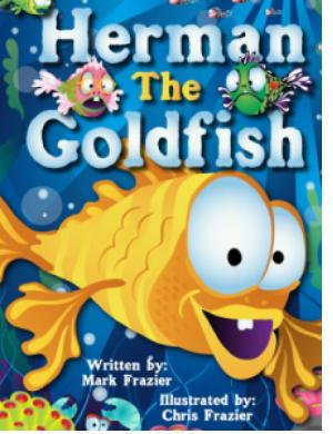
(Original Cover)
A cover can survive on a great typographical treatment alone, as well, so long as it isn’t too ‘over-the-top’. When using a type only cover, emphasis on different words in the heading is key. Stay away from using different colors in individual characters. When using type fonts, be careful not to ‘bastardize’ your font. (Taking a font and squishing it horizontal or vertical.) It’s just poor design. If you want or need a condensed font, then use a condensed font. When a word is too long, and doesn’t seem to fit your space, don’t squish it…use a condensed font!
The colors you select should have some relevance to the book. The colors should also have good contrast. The colors that Mark chose for his book are perfect for the subject matter. The blue and green for the background, depicts water and the gold and yellow was chosen for the main character. Initially, he added gold to the word ‘the’, which brought too much emphasis on the word…so the focus was placed on ‘the” and the ‘fish’.
Two additional fish added too much distraction. There was a lot of blue introduced within the title font, so there was a lot going on.
The suggestion was to:
> Lighten up the heading with more white. The drop shadow puts enough emphasis on the heading and was a good idea.
> Make the word ’the’ the same color as ‘Herman’ and ‘Goldfish’
> Remove or reduce the two fish with in the heading. Beautiful color selections.
Just these few modifications, made for a more powerful and striking cover!
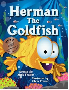
(Final Cover)
Let’s see that again, through another cover:
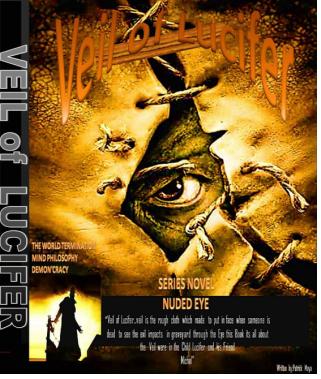
(Original Cover)
This Facebook follower chimed-in for some suggestions. I love it when people realize that they need a little help and I certainly don’t mind helping.
The cover he submitted, as you see, had a great illustration. The colors seem to mesh with the title of the book. It just needed some help with typography and placement.
The title blends in too close to the illustration. He was actually trying to curve the font, as not to cover the top part of the illustration. You can also see he tried to ’squish’ the font to make it fit within the space…..wrong. The solution — select an actual condensed typeface.
The type on the spine should be the same as the type on the cover.
He tried to say too much on the cover, distracting from the illustration. The type at the bottom of the book actually stood out more than the heading. There was another image added on the lower left-hand corner.
So……
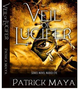
> Selected a font that works with theme of the book title. The font had some nice swashes on the initial caps.
> Made the font white for contrast and added a dark ‘glow’ to give dimension and contrast.
> Selected a condensed font for the ‘SERIES’ line because it was a long statement. It was necessary to place on the cover to let the reader know this book was of a SERIES.
> The author’s full name was placed in a solid area at the bottom
> The same font was used in the heading and author’s name
> All of the other information that was on the front should go on the book flap, if it has a jacket OR on the back cover
The end result was a legible and well designed cover!
Visit kidsShelf Books on Facebook and LIKE. Feel free to chime-in for suggestions.